
Download & Go

The Story
The pains of not having wifi/cellphone service or having limited data can be a pain to those that relay on streaming video entertainment. Download & Go will allow people to download content to their registered devices for offline viewing.
The Ask: To provide an easy way for users to discover and identify content they can download.
Project Details
ROLE: UI Designer, UX Research, UX brainstorming
TOOLS: Sketch, Confluence, Slack, Abstract
DELIVERABLES: Not delivered
The Research (user testing)
Because AT&T currently does not have this feature, user testing was done on competitors that had the download and go option. The goals of this was to explore user behavior and use cases for downloading, identify user comprehension in downloading process and to uncover user expectations or preferences in download in process.
Research Findings
• Competitor UI is generally understood, but icons are very subjective, and users tend not to read small text as a whole.
• Downloading was discovered, rather than sought out.
• Competitor experience is easy for existing users – and learnable for new users.
• Loss of content is a delicate issue (Some participants were resistant to expiring content)
• Participants were confused about streaming versus downloading, and anecdotal accounts support this confusion. Apps do not seem to clearly distinguish between these two actions.
Competitive Audit (Discovery of Downloadable Content)
This competitive audit looks at Download & Go feature on other services (Netflix, YouTubeRed, Amazon, Apple TV, and Xfinity).


Netflix
YoutubeRED
Amazon Prime
Key Findings
• Discover - Download CTA is only accessible from Info screen
• Discover - One-Tap-Download CTA is available from a Series Info level for EACH episode
• Identify - Users can identify which content is downloadable by the original badged/labeled content (i.e. Netflix Originals, Youtube Originals)
Design Approach
• Find areas where users can identify which content is downloadable.
• Find areas where the user would want to download content.
• Consider On-Tap-Download from multiple areas (carousel area, info area)
Whiteboarding

Opportunities:
• Search - Available to Download filter
• MyTV carousel - downloadable content or badging on content you can download
• Download screen - Find Something to Download
• Common Info screen - Download CTA
UI Iterations
Option1
• Progression is easy to see
• Not clear what can be watched and cannot be watched
• Progression can work on all screens, but what is downloaded might not be clear on other screens

Option2
• Progression is in consistent area
• Clear on what can be watched and not watched
• Can feel like a lot is going on in a small area
• Might not work on screens with different background colors
Design Challenges
• Designing clear cases for multiple downloads, errors, queues and completed downloads
• Designing a template that would be able to work across multiple areas of the app
• Working with motion to make the timing of the progress feel effortless and
easy to understand
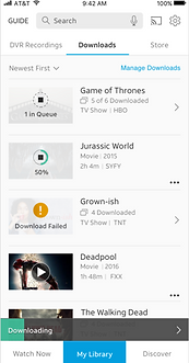
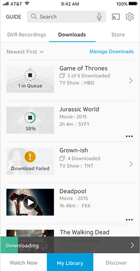
The Final Prototype
Download & Go is currently on pause until further notice.
