
Roku Enhancement

The Story
A recent internal competitive benchmark came out to show how users felt about our app on Roku compared to similar competitors. It rated low on an overall rational, emotional and meaningful experiences.
The Ask: Find out why our users were unsatisfied with the DIRECTV Now on Roku design.
Project Details
ROLE: UI Designer, UX Brainstorming
TOOLS: Keynote, Confluence, Slack
Design Approach
-
Gather Insights through Research
-
Define Areas of Improvement.
-
Iterate on Designs Identified as Issues.
Analytics
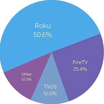
After reviewing the analytics, it was discovered that 1 out of every 2 AT&T TV’s users were watching using a Roku device.
Benchmark Study
Considering that the majority of our users experience our product on Roku competitive benchmark research was conducted on the Roku platform in January using the REM (Rational, Emotional, Meaningful) framework.

Key Findings
• Users were unsatisfied with the overall experience when compared with competitors.
• Users were not satisfied with the lag in the experience and that the interface was not intuitive enough.
• Some felt that the DVR experience was inconsistent.
Improvements and Iterations

One of the pain point areas of the app was the audit trail. I brainstormed with UX to figure out how to make the audit trail more intuitive.

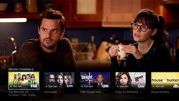
Another improvement that we were able to get in was the channel tray feature. This feature allowed users to quickly tune to previously watched channels through a light menu
Final
We worked side by side with product and engineering to improve the overall AT&T experience on Roku. Visual implementations were improved. The lag experience were worked on and improved. The channel tray experience was a delight to have.

